Gestalt Theory and its Principles
“Gestalt” is German for “shape” or “form” and Gestalt Theory was devised by German psychologists Max Wertheimer, Kurt Koffka and Wolfgang Kohler in the 1920s.
“The whole is other than the sum of the parts.” — Kurt Koffka
Gestalt Theory is based on the way humans perceive objects as their brains will attempt to simplify a group of complex design elements such that these elements are perceived as a whole instead of their individual parts. We see a collection of objects as a whole rather than entirely separate entities. There are several ideas behind Gestalt Theory: Emergence, Reification, Multi-stability, Invariance and Prägnanz.
Emergence
It is the process where the brain creates complex pictures from simple patterns. The first thing humans do to recognise an object is to identify its outline. After matching the outline with familiar objects with similar shapes, we start identifying the parts that up the complex object.

Reification
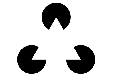
It is the constructive aspect of perception where an object contains more spatial information than what is actually present. If there is no exact match to the outline of an object, we find the nearest match and fill in the gaps with what we think we should see.

With reference to the image above, we visualise a white triangle even though there is no direct shape of a triangle. In fact, the image consists of 3 circles with the inner cuttings of an edge of a triangle. Reification suggests that a complete outline is not necessary for us to see the object if parts of the outline can form a shape or pattern.
Multi-stability
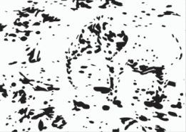
It is the tendency of ambiguous perceptual experiences to switch between alternative interpretations. There can be more than one way to perceive some objects.
With reference to the image above, both the wolf and the boy’s silhouette cannot be seen at the same time. Instead, it is necessary to switch between the 2 alternatives. One of the alternatives might be your dominant perception and it will be harder to see the weaker alternative if you continue seeing the dominant alternative.
If the objective of a design is to change the way someone perceives something, multi-stability is a good idea to incorporate in the design. By giving them 2 alternatives, designers can work on strengthening the alternative, that is perceived as weak, to get people to change their perceptions.
Invariance
It is the property of perception whereby simple objects are recognised despite their rotations, scale and translations. Given that we can recognise objects from different perspectives, we can also recognise them if they are slightly different in terms of appearance.

Prägnanz
It implies that individuals will eliminate complexity and unfamiliarity when they perceive the world so that they see the most simplistic form of objects. People are inclined to prefer simple minimalist designs as such designs require lesser processing time. There are various principles that explain the ways humans perceive objects: laws of similarity, symmetry, proximity, closure, continuity and common fate.
Similarity
Human minds group elements with similar characteristics together as one entity. Colour, shape, size and texture can signal that elements belong to the same group and likely share a common meaning or functionality. This principle can be used in design to bring together elements that are not near to each other.

An example of similarity in many websites online is their buttons. They usually have the same rectangular shape to indicate that they are clickable buttons.
Symmetry
It states that human minds perceive objects as symmetrical shapes that form around a centre point. It is human nature to look for order among chaos, thus, we tend to appreciate symmetry which can give us balance and solidity.

Proximity
It states that humans perceive objects that are close to each other as a group. We are able to understand words as letters with proper kerning form different individual words.

With reference to the image above, our minds perceive each vertical bar in the poster to combine and form a single image of a deer.
Closure
It implies that humans perceive forms and figures in their complete appearance despite the absence of one or more of their parts, either hidden or totally absent. Our eyes are able to fill in the missing information to complete the figure.

By using law of closure, the negative space between the E and the X and tight kerning between the letters makes the arrow visually apparent. This carries a good message that the company is speedy, reliable and forward thinking.
Continuity
Human minds continue visual, auditory and kinetic patterns. Objects that are plotted in a continuous pattern are grouped together in our minds. Even if a line stops, the viewer is able to follow it.

The sharpened pencil’s thin green line helps to guide the eye from the top of the composition to the bottom, creating a christmas tree shape in a unique way.
Common Fate
Human minds perceive visual elements that move in the same direction as a group or unit. Regardless of how far apart the elements are placed or how dissimilar they appear to be, as long as they seem to be moving in the same direction, they will be perceived as a group.

With reference to the image above, the fish shapes flow together in the same direction before turning into a bigger fish seen at the top of the poster.
Conclusion
Gestalt Theory and its principles describe how everyone perceive objects. They are the foundation of visual design and using them in design can significantly improve the user experience.
References
